Using Heat Maps to Visualize Financial Performance
You’re juggling margins, utilization, and a thousand small cost drivers — and leadership wants answers now. Heat maps cut through noise, showing where to act first so you stop firefighting and start improving results.
Summary: Heat maps help finance and operations leaders turn multi-dimensional financial data into visual priorities. The win: faster decisions, clearer conversations with clinical teams, and targeted cost or revenue actions that move margin.
What’s the real problem?
Healthcare finance teams sit on complex, high-volume data: supplies, labor, case mix, payer mix, and department-level performance. The information exists, but pattern recognition doesn’t. Leaders struggle to see where variation matters most.
- Symptoms: long meetings where data is rehashed without a clear action list.
- Symptoms: cost improvement projects launched with no idea which units will yield the biggest return.
- Symptoms: leadership dashboards that list metrics but don’t show relative urgency or risk.
- Symptoms: finance teams buried in spreadsheets, unable to tell a clear story to the CEO or board.
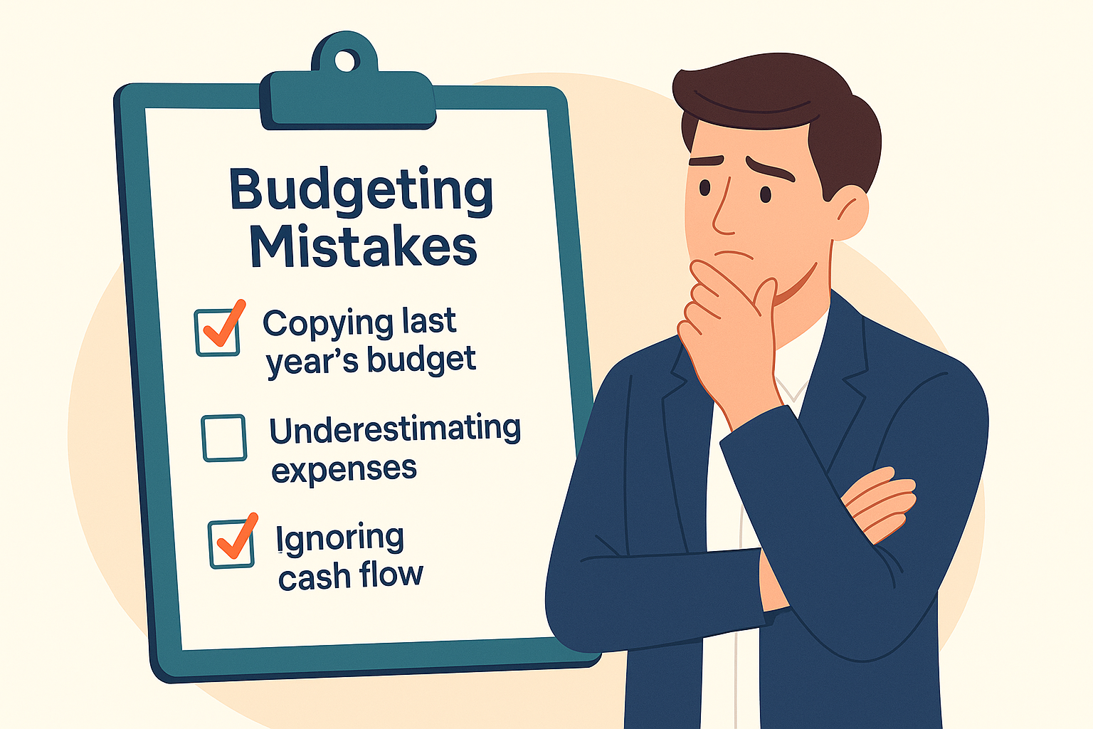
What leaders get wrong
Many well-intentioned leaders treat visualizations as decoration rather than decision tools. They expect a single static report to solve complexity. Other common missteps:
- Overloading dashboards with every metric — the result is signal loss, not insight.
- Using color without hierarchy — red everywhere equals paralysis, not priority.
- Ignoring context — a high-cost unit may be high-value clinically; heat maps should pair cost with outcomes or volume.
- Waiting for perfect data — partial, well-structured visuals beat perfect but unusable reports.
A better approach
Think of a heat map as a triage tool. It highlights where to dig deeper and where to monitor. Use this simple 4-step framework:
- Define the question. Is the priority reducing supply spend, improving labor efficiency, or protecting margin on high-acuity cases?
- Select dimensions. Pick 2–4 axes that matter (e.g., unit, cost category, variance vs budget, volume change).
- Create the map and add thresholds. Use color bands tied to business rules (e.g., >10% variance = red).
- Act and iterate. Assign owners, run a 30–60 day intervention, then update the map to show impact.
Quick story: a mid-sized hospital used a simple heat map pairing supply cost per case against case volume by service line. The heat map exposed a high-cost, low-volume service where a change in vendor contracts produced an 8% reduction in supply spend in three months. The visual made the case for action in the boardroom — fast.
Quick implementation checklist
- Pick a pilot: one cost center or service line underperforming vs budget.
- Gather data: actuals, budgets, volumes, and a simple outcome or quality measure.
- Choose your axes: e.g., variance % (x) and spend per unit (y); size = volume.
- Build the initial heat map in Power BI or your BI tool with three color thresholds.
- Annotate: add notes for outliers and known normalization factors (seasonality, staffing events).
- Circulate to ops partners with two recommended actions and an owner for each.
- Run a 30-day check to capture early wins and adjust thresholds.
- Document decisions and link back to the map for future transparency.
What success looks like
- Accuracy: >90% of identified hotspots lead to validated root-cause investigations.
- Cycle time: decision-to-action shortened from 30+ days to 7–14 days for prioritized items.
- Financial: first-wave ROI of 3–6x on time spent for targeted initiatives (e.g., supply or labor).
- Adoption: 80% of operational leaders reference the heat map in monthly reviews.
- Clarity: meeting time spent on review drops by 25% — replaced with action tracking.
Risks & how to manage them
- Risk: False positives from noisy data. Mitigation: validate top 5 hotspots with quick root-cause checks before major interventions.
- Risk: Color fatigue — everything flagged as urgent. Mitigation: use business rules and relative thresholds; keep three tiers (monitor, review, urgent).
- Risk: Ownership gaps — maps show problems but no one acts. Mitigation: assign owners up front and track actions in the next report cycle.
Tools & data
Heat maps work best with good underlying data and lightweight automation. Practical toolset examples:
- Finance automation for daily or weekly actuals ingestion so visualizations reflect near-term reality.
- Power BI (or Tableau) to build interactive heat maps that leaders can click into for drill-downs.
- Integrated data model tying GL, volumes, and clinical measures so cost and outcomes live together.
- Leadership reporting packs that use the map as the first slide — priority view — and follow with root causes and actions.
Next steps
Start small. Pick a service line or a major cost category and run a two-week pilot. Build the heat map for one audience — the COO or CFO — and use it to drive one decision this month. If you want help turning the pilot into a repeatable capability, contact Finstory. We’ll scope a pilot, stand up the visuals, and coach your team through the first three improvement cycles.
Work with Finstory. If you want this done right—tailored to your operations—we’ll map the process, stand up the dashboards, and train your team. Let’s talk about your goals.
📞 Ready to take the next step?
Book a 20-min call with our experts and see how we can help your team move faster.
Prefer email or phone? Write to info@finstory.net
or call +91 44-45811170.